08Logo system · launch animation · 60-second film标志系统 · 开屏动画 · 60 秒短片
Brand, motion & film品牌、动效与短片
The 林光 mark (two trunks and a beam of light), its launch animation, and a 60-second film cut to a 100 BPM grid.「林光」标志(两根树干和一束光)、它的开屏动画,以及一部按 100 BPM 节拍剪辑的 60 秒短片。
01The problem问题
A flame that read as a letter.一团读起来像字母的火苗。
Two products, no system两个产品,没有体系
The desktop app, the phone app, the console and the docs each had their own small icon. Nothing tied the ecosystem together.桌面端、手机端、控制台和文档各有各的小图标,没有任何东西把整个生态串起来。
Small sizes break shapes小尺寸会把形状弄坏
A gradient mark that looks good at 1024 px turns to mush at 16 px in a menu bar or a browser tab.在 1024 像素下好看的渐变标志,缩到菜单栏或浏览器标签的 16 像素就糊成一团。
A launch with no show开屏什么都没演
The first launch animation was cut off as soon as the app was ready, so people saw a flash, not a logo.第一版开屏动画在应用一就绪时就被切掉,大家只看到一闪,看不到标志。
02What I built我做了什么
One shape, two lights.一个形状,两种光。
The 林光 mark「林光」标志
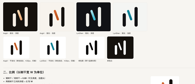
Two trunks of different heights and a beam of light that floats between them. The beam never touches a trunk or the ground, so it reads as light, not as the third stroke of an N.两根高低不同的树干,中间悬着一束光。光不碰树干,也不落地,所以读作「光」,而不是 N 的第三笔。
Built for every size每个尺寸都能用
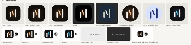
At 32 px and below the gradient becomes a flat light and the mark is redrawn on the pixel grid, so trunk edges land on whole pixels. The wordmark is redrawn from the mark’s own strokes: one stroke width, round ends.32 像素及以下,渐变改成平涂光,并按像素网格重画,让树干边缘落在整像素上。字标按标志自己的笔画重画:单一笔宽,圆头。
Lumen, the character角色 Lumen
The earlier ember icon stayed on as the phone app’s companion: same colours, now with eyes, a breath and seven moods.早先的火苗图标留了下来,成为手机端的伙伴:颜色不变,多了眼睛、呼吸和七种状态。
The launch, slowed down on purpose开屏,故意放慢
Version 0.10.1 plays the whole entrance on every cold start (2.05 s), holds for 450 ms, then fades into the app. A click or key skips it. It is the only animation in the design system allowed to run longer than 400 ms.0.10.1 起,每次冷启动都完整播放入场(2.05 秒),停 450 毫秒,再淡入应用。点击或按键可以跳过。它是设计规范里唯一允许超过 400 毫秒的动画。
03How it works怎么做的
One geometry, every output.一份几何,所有产出。
04Interface and details界面与细节
Storyboard to film.从分镜到成片。


Video视频
The promo film.宣传片。
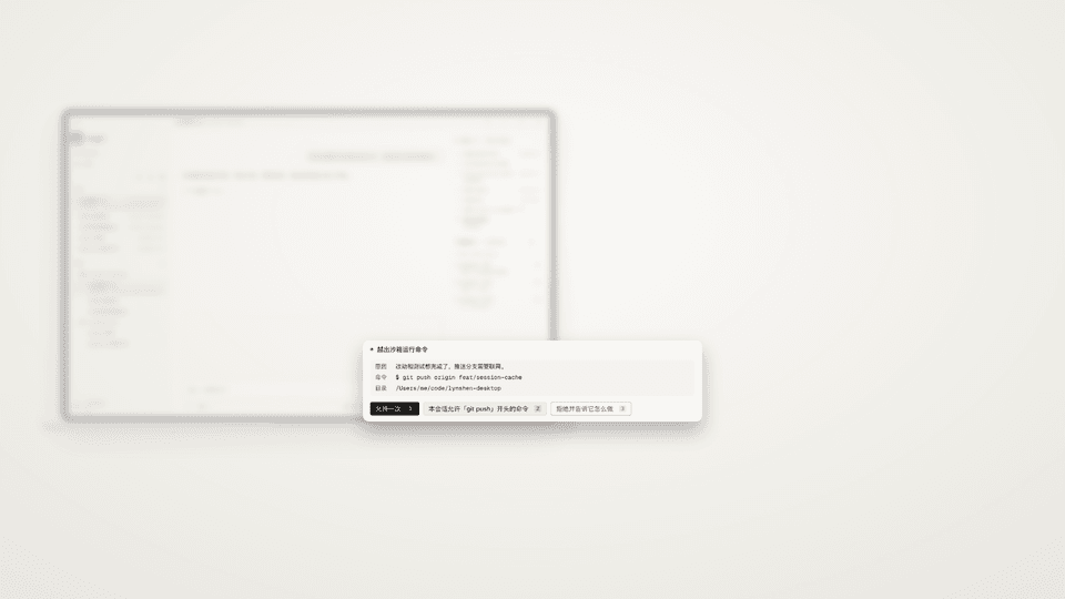
60 seconds, 25 bars at 100 BPM, six kinds of camera move, two silences. Built in Remotion from real screen recordings with demo data.60 秒,100 BPM 下 25 小节,六种镜头运动,两处静音。用 Remotion 搭建,素材是真实录屏和演示数据。
With sound. The red “预览” (preview) badge marks this as a review cut; a few screens still show the earlier logo.有声音。右上角红色「预览」表示这是审片版;部分画面里还是旧标志。
05Tech used用到的技术
What it’s made of.用什么做的。
- Logo标志
- SVG
- Pixel-grid small sizes像素网格小尺寸
- ICO · ICNS
- Icon Composer
- Android adaptive iconsAndroid 自适应图标
- Motion动效
- CSS keyframes
- transform + opacity only只用 transform 和 opacity
- prefers-reduced-motion
- brand.test.ts
- Film短片
- Remotion
- React
- FFmpeg
- −14 LUFS
06What I learned我学到了什么
Lessons I’ll keep.会一直记得的几件事。
- Test the brand like code. A unit test checks contrast, the timetable and the keyframes, so the logo can’t quietly drift between releases.像测代码一样测品牌。单元测试检查对比度、时间表和关键帧,标志不会在版本之间悄悄走样。
- Feedback beats taste. “The animation is too fast, there is no animation” was the most useful sentence in the project; the fix was in when it plays, not how it looks.反馈比品味更有用。「动画太快了,根本没有动画」是整个项目里最有用的一句话;问题在什么时候播放,而不是长什么样。
- Cut on the beat. Locking every scene change to a bar line made a 60-second film feel deliberate instead of busy.剪在拍子上。每次换镜头都对齐小节线,60 秒的短片就显得从容,而不是忙乱。